-
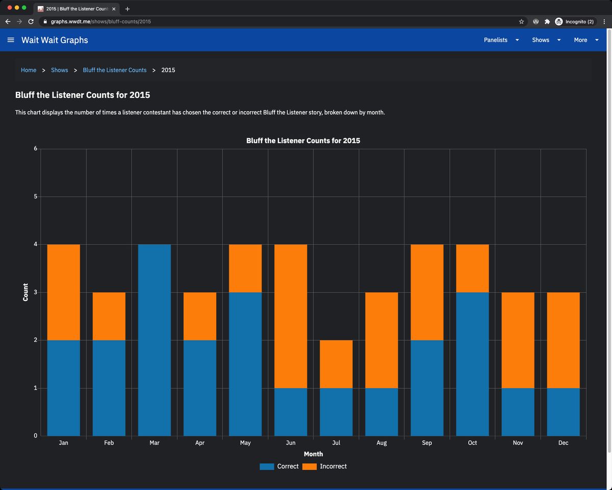
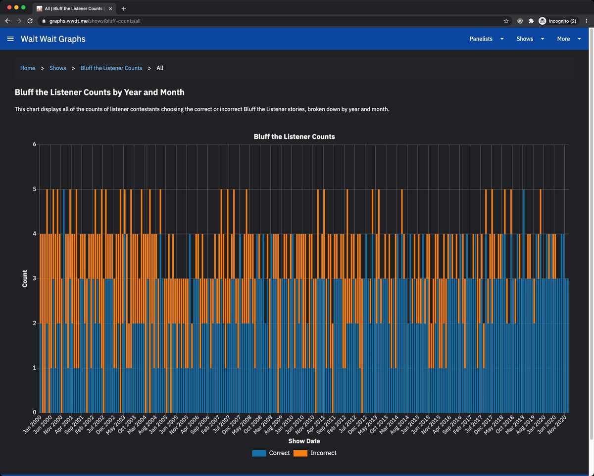
I have published a new graph section at the @waitwait Graphs Site that present how well listeners have done in choosing the correct Bluff the Listener story. One shows the numbers for a given year and one across all years; both on a monthly basis: graphs.wwdt.me/shows/bluff-counts
-
This was the result of discussing Bluff the Listener data with another @waitwait fan. They had a hunch that the listeners have gotten better at guessing the correct Bluff story. I presented them with the raw data while I worked on building out the code to generate the graphs.
-
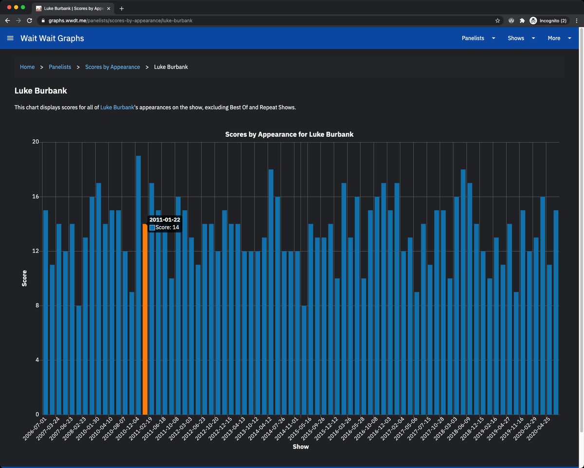
In addition to the new graphs, I have changed the Panelist Scores by Appearance graph to be a bar graph rather than a line graph. This should make it easier and faster to interpret. graphs.wwdt.me/panelists/scores-by-appearance
-
Lastly, I have updated when the tooltip appears when hovering over the graph. The tooltip used to appear when hovering over any point of the graph. Now, the tooltip will only appear when hovering over a bar or a point in the graph. This will make for cleaner graph image exports.


